Wingback
Brand world for a YC W22 SaaS startup in pricing and billing. They asked me for a visual direction. I built them a universe.
Client
WingbackYear
Dec 2022 – Feb 2025Role
Brand designer & art directorScope
Identity · Website · Pitch & sales decks · Social kit · Illustrations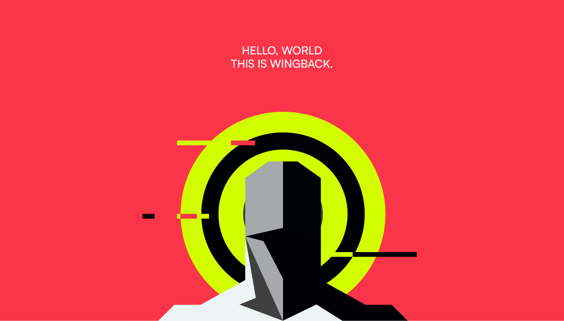
Prologue
Some brands need a logo. Some need a world.
Wingback sells pricing and billing infrastructure: invisible, technical, hard to love. Over two years I gave it a universe with its own mythology, heroes, laws and map.
The visual identity is only the surface. Underneath is the meaning: what the product stands for, who it serves, and how every piece connects. This is the project where
I stopped being only a designer and became the architect
of a brand’s meaning.
Context
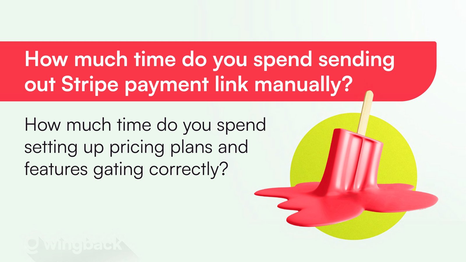
Wingback came out of Y Combinator with a pricing and billing platform for subscription companies and a fresh $2.3M pre-seed. Billing is invisible when it works. That makes it hard to sell, and even harder to remember. When I joined in December 2022, the brand spoke in loud gradients and stock 3D objects, a melting popsicle and cracked eggs, that said nothing about the product.
Tension
The team was searching for its voice. They wanted to be original, but didn’t know where to go. In 2022 the whole tech world seemed dressed in the same blue, and everyone was pointing it out. Wingback didn’t want to be one more blue logo in the crowd. It needed a voice that could win over investors and still earn the trust of teams handing over their revenue.
The idea
Human first. Technology is here to serve people, not to overshadow them.
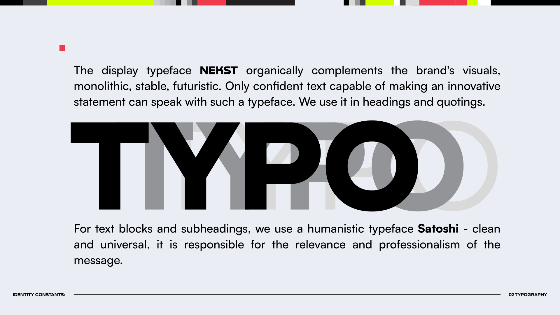
I cast the human as an idol: a monumental figure at the center, crowned with a halo. Technology became the architecture around it, the way brutalist monuments hold a city: raw, heavy, geometric, built to outlast trends. Some of them stand right here in Tbilisi, and they feel like relics of a future that never quite arrived.
For the voice I turned to Constructivism and the Russian avant-garde: the courage of bright color, sharp forms and constant motion. And I kept coming back to Justice’s “Civilization” video, with its epic scale and its feeling of a world being built in front of you.
The search was part of the story. In 2022 I ran early Midjourney experiments, not to make the final art, but as vibe research: a fast way to see how far a strange idea could go before building it in vectors.
The system
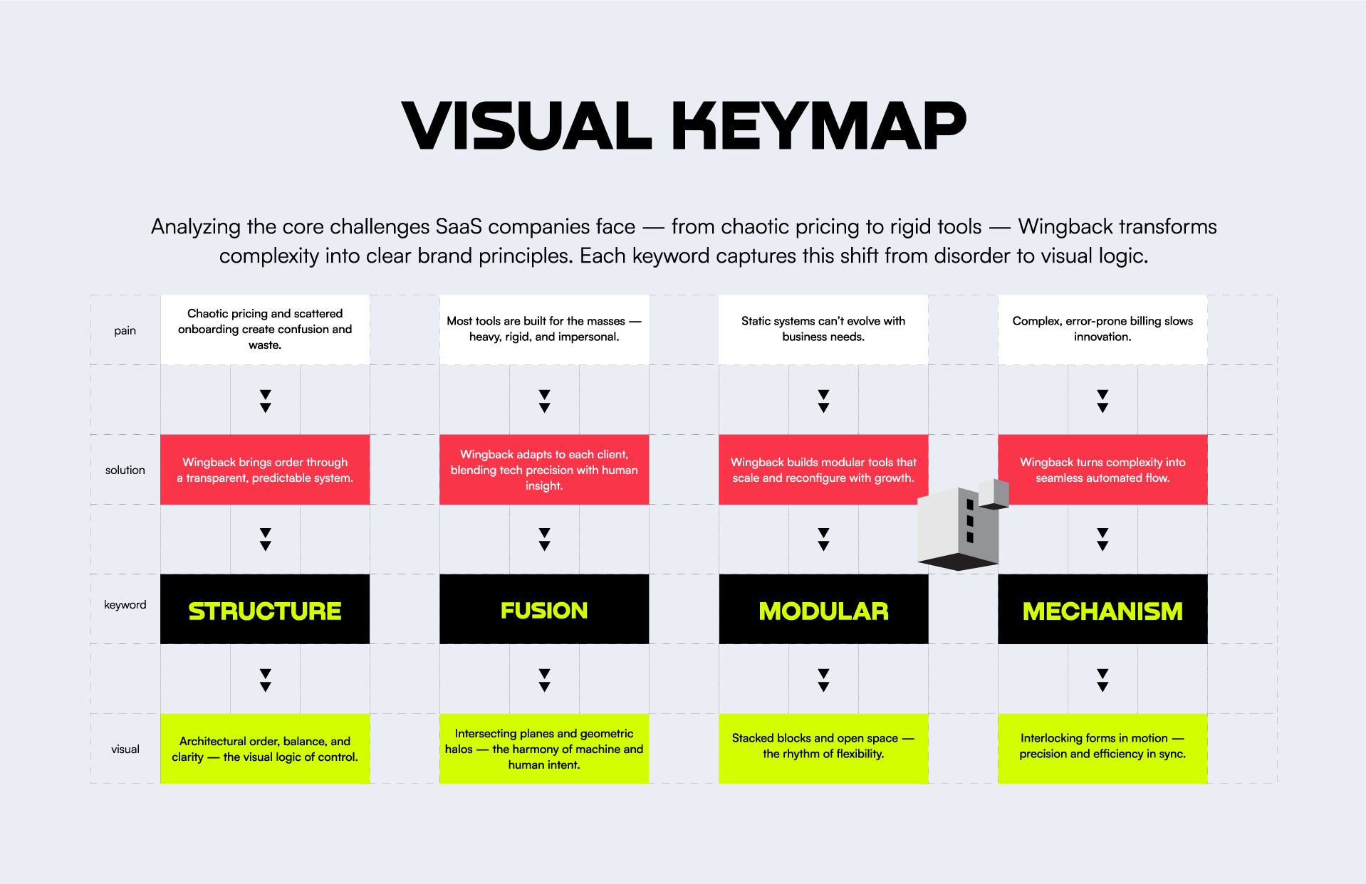
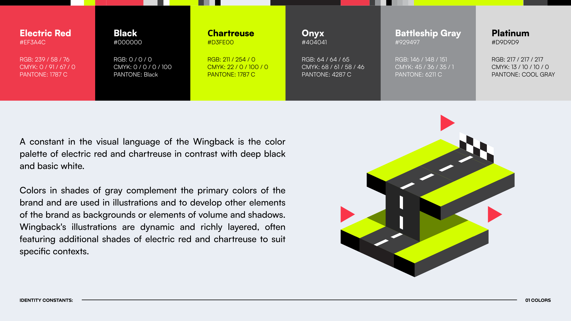
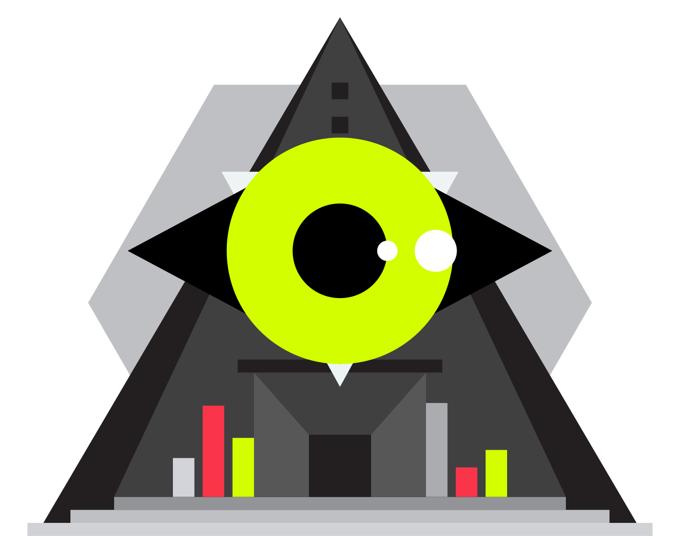
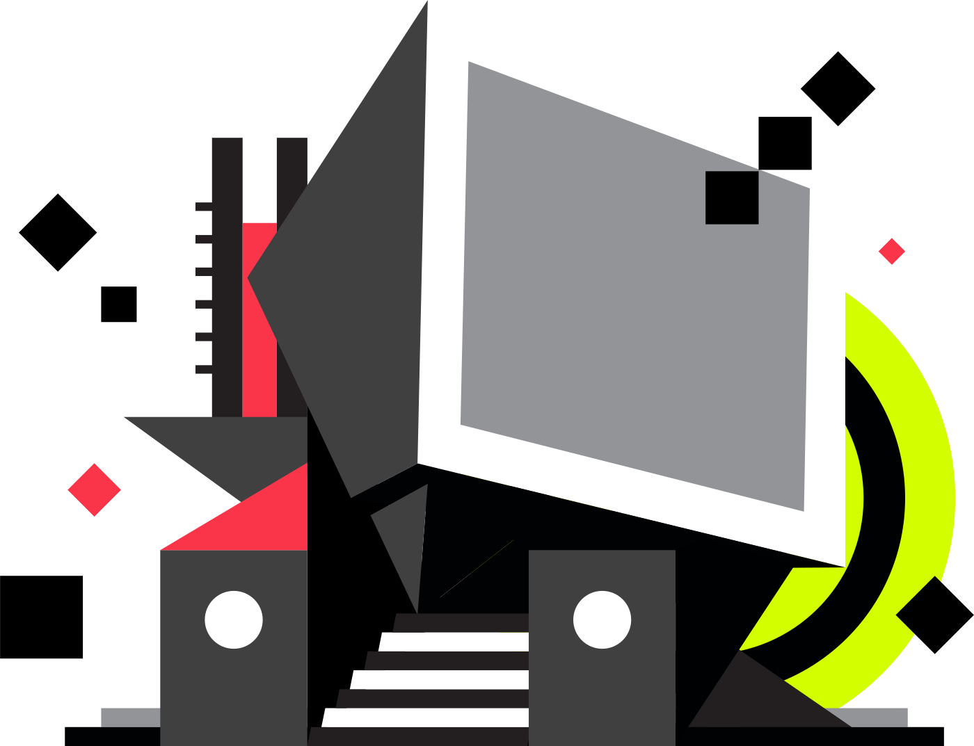
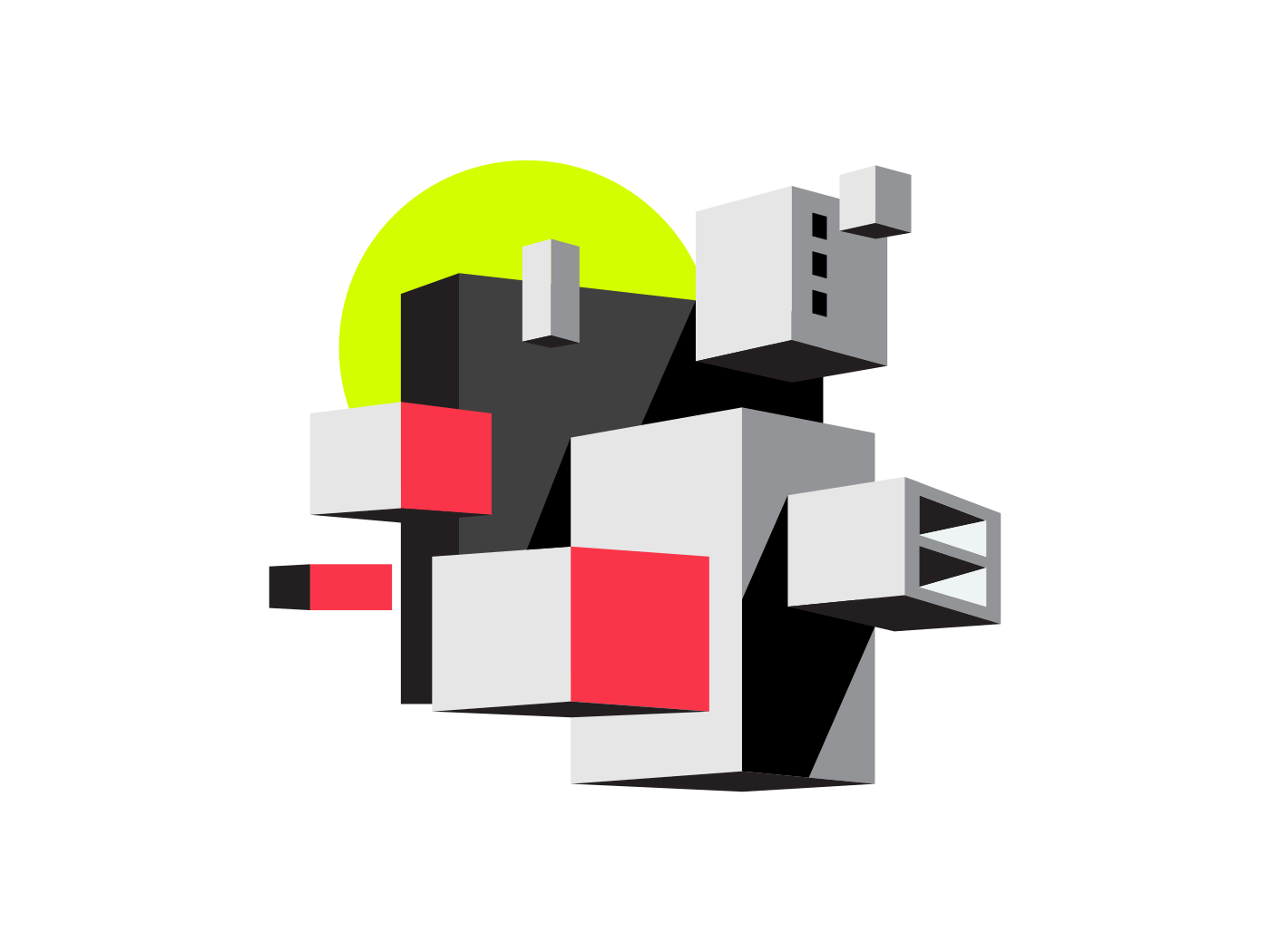
A visual keymap turned each customer pain into a brand principle: Structure, Fusion, Modular, Mechanism. From there came the identity constants: electric red and chartreuse against black and grays, NEKST for display, Satoshi for text. Every product page got a feature hero, a machine that shows what the tool does, like the Core Architect and the Primary Engine. The brandbook calls them ambassadors of technology to humanity.
Choices
No blue. Electric red and chartreuse against deep black: colors you can’t mistake for anyone else’s. Instead of clean tech polish, weight and pathos. The tone of voice followed: monumental, expressive, confident, expansive. And in every composition, the human stays at the center.
Beyond the visuals
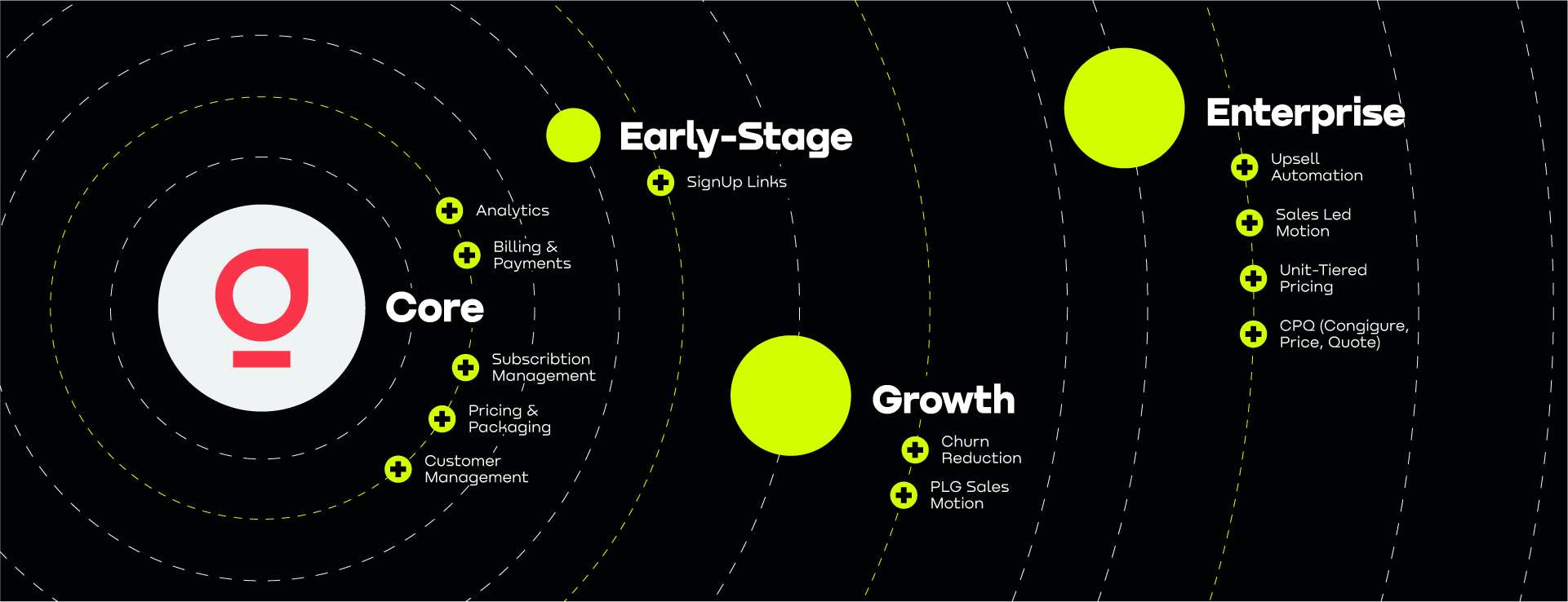
My role grew past the pictures. I helped sharpen Wingback’s positioning and value proposition, and built the Wingback Continuum: a map of the whole product ecosystem, from Core to Early-Stage, Growth and Enterprise. It turned a list of features into a story of growth that sales and investors could follow. Later I drafted a strategy for the company’s next stage.
Result
One visual language across the website, pitch and sales decks, roadmap materials and a social kit the team keeps reusing. The system kept growing: by December 2024 the brandbook reached its second volume. A later launch, Signup Links by Wingback, reached #8 Product of the Day on Product Hunt.
The startup path was less linear. Wingback raised its pre-seed and went through Y Combinator, but the follow-on round never came together. The product is still live and in use.
Before
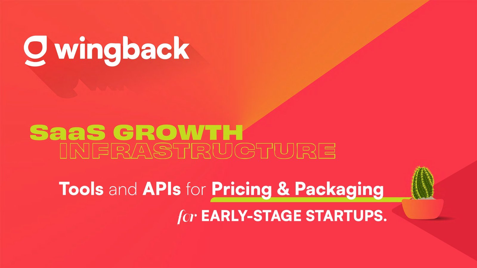
2022 · the sales deck I inherited
The idea in one line
Human first.
Technology serves people.
Inside the Wingback world
After · the brand system, 2022–2025

Feature heroes: machines built with purpose

Keep exploring
More work →